GDELT + Stock Data: Correlation Analysis
Alright, maybe we need to step back a bit here. I'm jumping so quickly into these theories that I'm probably rushing things and missing key insights or leads to new strategy ideas. Lets start with our initial data. I'm going to keep it generalised to complete economic data just for the last year. I'm eager (perhaps naively) for quick returns. I would send an empty query but queries are limited to a minimum of 4 letters.
from collections import Counter
from backtesting import Strategy
from backtesting.lib import crossover
from gdeltdoc import GdeltDoc, Filters
import pandas as pd
import matplotlib.pyplot as plt
import yfinance as yf
import numpy as np
from scipy.stats import pearsonr, zscore
import seaborn as sns

START_DATE = "2023-12-30"
END_DATE = "2024-12-30"
TICKER = "SPY"
SEARCH_TERM = "economy"
We can get our data in the same way we did before. However, I'm going to add in search results article count and total article count in the hopes there's something there.
# Set up GDELT filters
f = Filters(
    keyword=SEARCH_TERM,
    start_date=START_DATE,
    end_date=END_DATE,
    #theme="WB_625_HEALTH_ECONOMICS_AND_FINANCE"
)

gd = GdeltDoc()
articles = gd.article_search(f)
timeline_tone = gd.timeline_search("timelinetone", f)
timeline_raw = gd.timeline_search("timelinevolraw", f)
timeline = timeline_tone.merge(timeline_raw, how="left", on="datetime")
timeline
| datetime | Average Tone | Article Count | All Articles | |
|---|---|---|---|---|
| 0 | 2023-12-30 00:00:00+00:00 | 0.2448 | 6307 | 111724 |
| 1 | 2023-12-31 00:00:00+00:00 | 0.2038 | 8796 | 129642 |
| 2 | 2024-01-01 00:00:00+00:00 | 0.4657 | 6215 | 89190 |
| 3 | 2024-01-02 00:00:00+00:00 | 0.1338 | 7402 | 113699 |
| 4 | 2024-01-03 00:00:00+00:00 | -0.0392 | 8467 | 140100 |
| ... | ... | ... | ... | ... |
| 362 | 2024-12-26 00:00:00+00:00 | 0.4670 | 9350 | 142705 |
| 363 | 2024-12-27 00:00:00+00:00 | 0.1646 | 10576 | 158638 |
| 364 | 2024-12-28 00:00:00+00:00 | 0.5111 | 6214 | 107098 |
| 365 | 2024-12-29 00:00:00+00:00 | 0.2791 | 4873 | 83258 |
| 366 | 2024-12-30 00:00:00+00:00 | 0.4826 | 9122 | 124712 |
367 rows × 4 columns
Like a true data scientist, lets plot these variables to see if anything is going on.
# Plotting the data with separate y-axes for each line
fig, ax1 = plt.subplots(figsize=(12, 6))

# Plot Average Tone on the first y-axis
ax1.plot(timeline['datetime'], timeline['Average Tone'], label='Average Tone', color='blue', linewidth=1.5)
ax1.set_ylabel('Average Tone', color='blue')
ax1.tick_params(axis='y', labelcolor='blue')

# Create a second y-axis for Article Count
ax2 = ax1.twinx()
ax2.plot(timeline['datetime'], timeline['Article Count'], label='Article Count', color='green', linewidth=1.5)
ax2.set_ylabel('Article Count', color='green')
ax2.tick_params(axis='y', labelcolor='green')

# Create a third y-axis for All Articles
ax3 = ax1.twinx()
ax3.spines['right'].set_position(('outward', 60))  # Offset the third y-axis
ax3.plot(timeline['datetime'], timeline['All Articles'], label='All Articles', color='red', linewidth=1.5)
ax3.set_ylabel('All Articles', color='red')
ax3.tick_params(axis='y', labelcolor='red')

# Adding labels and title
plt.title('Trends Over Time for Average Tone, Article Count, and All Articles')
plt.grid(alpha=0.3)

# Adding legends
fig.tight_layout()  # Adjust layout to accommodate multiple y-axes
plt.show()
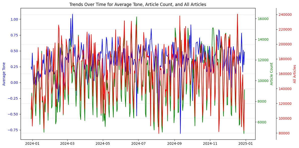
So insightful. The problem is that there is just too much data and too much change day to day to spot any patterns by sight alone. Lets prepare our financial data and collect everything together before we do some more analysis.
def get_tone(df):
  tones = [0 for i in range(df.shape[0])]
  timeline["datetime_clean"] = timeline.datetime.dt.date
  for index, date in enumerate(df.index):
    if date.date() in list(timeline.datetime.dt.date):
      tones[index] = float(timeline[timeline.datetime_clean == date.date()]["Average Tone"])
    else:
      tones[index] = 0
  return pd.Series(tones)

def article_count(df):
  count = [0 for i in range(df.shape[0])]
  timeline["datetime_clean"] = timeline.datetime.dt.date
  for index, date in enumerate(df.index):
    if date.date() in list(timeline.datetime.dt.date):
      count[index] = float(timeline[timeline.datetime_clean == date.date()]["Article Count"])
    else:
      count[index] = 0
  return pd.Series(count)

def article_all(df):
  count = [0 for i in range(df.shape[0])]
  timeline["datetime_clean"] = timeline.datetime.dt.date
  for index, date in enumerate(df.index):
    if date.date() in list(timeline.datetime.dt.date):
      count[index] = float(timeline[timeline.datetime_clean == date.date()]["All Articles"])
    else:
      count[index] = 0
  return pd.Series(count)

def get_volume(df):
   return df.Volume

data = yf.download(TICKER, start=START_DATE, end=END_DATE, multi_level_index=False)

data["Average Tone"] = list(get_tone(data))
data["Article Count"] = list(get_article_count(data))
data["All Articles"] = list(get_all_count(data))

data
| Close | Volume | Average Tone | Article Count | All Articles | |
|---|---|---|---|---|---|
| Date | |||||
| 2024-01-02 | 466.663940 | 123623700 | 0.1338 | 7402.0 | 113699.0 |
| 2024-01-03 | 462.852844 | 103585900 | -0.0392 | 8467.0 | 140100.0 |
| 2024-01-04 | 461.361969 | 84232200 | -0.0177 | 11418.0 | 171729.0 |
| 2024-01-05 | 461.993866 | 86060800 | 0.0540 | 9509.0 | 159932.0 |
| 2024-01-08 | 468.589294 | 74879100 | 0.1491 | 8584.0 | 145645.0 |
| ... | ... | ... | ... | ... | ... |
| 2024-12-20 | 591.150024 | 125716700 | 0.4267 | 11918.0 | 170707.0 |
| 2024-12-23 | 594.690002 | 57635800 | 0.3075 | 10892.0 | 169788.0 |
| 2024-12-24 | 601.299988 | 33160100 | 0.4874 | 8868.0 | 132293.0 |
| 2024-12-26 | 601.340027 | 41219100 | 0.4670 | 9350.0 | 142705.0 |
| 2024-12-27 | 595.010010 | 64847900 | 0.1646 | 10576.0 | 158638.0 |
250 rows × 5 columns
I'm thinking we can start with some correlation analysis. Its probably better to let the data lead the way rather than guessing what might be the best approach.
# Calculate the correlation matrix
correlation_matrix = data[['Volume', 'Average Tone', 'Article Count', 'All Articles']].corr()

# Create a heatmap
plt.figure(figsize=(8, 6))
sns.heatmap(
    correlation_matrix,
    annot=True,
    cmap='coolwarm',
    fmt='.2f',
    linewidths=0.5,
    cbar_kws={'label': 'Correlation Coefficient'}
)

# Add labels and title
plt.title('Correlation Matrix Heatmap')
plt.xticks(rotation=45)
plt.yticks(rotation=0)
plt.show()
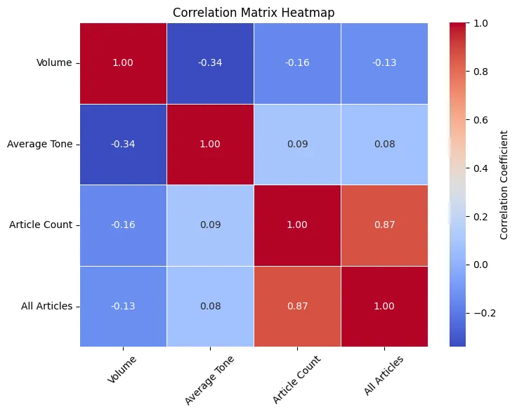
Now that is unexpected. Most of the correlations here are to be expected but seeing a correlation between "Volume" and "Average Tone" is interesting. Lets check if its statistically significant.
pearsonr(data["Volume"], data["Average Tone"])
PearsonRResult(statistic=np.float64(-0.34058738224457286), pvalue=np.float64(3.309642087743323e-08))
I think we've found a trend. Not really sure what to do with that. Its probably the first step in getting to a proper strategy.