Peter-Clark Algorithm on S&P 500 Stock Data
In a previous post, I learned that you can't use "Average Tone" from the GDELT Project to predict the movement in a stock price. Granted, it could be the case that some of the parameters used aren't appropriate. Before getting back into that, I want to explore an idea I have to graph causal relationships between different stocks.
The idea is that we can presume certain stocks move in relation to the movement of other stocks. The goal is to produce a digraph where each node is a different stock and the edges represent how certain nodes / stocks influence each other. We may have multiple edges leaving a node, or multiple edges entering a node.
Before performing the analysis, we need to prepare our data. I'm going to limit the dataset to stocks within the S&P 500 and only include data from 2017-01-01 to 2024-12-31. First things first, we need a list of the stocks themselves. I took the data from Wikipedia, using this website to download the table as a csv file.
import pandas as pd
import yfinance as yf
from datetime import datetime

symbols = pd.read_csv("S&P_tickers.csv")
symbols["Date added"] = pd.to_datetime(symbols["Date added"])
symbols.head()
| Symbol | GICS Sector | Date added | Founded | |
|---|---|---|---|---|
| 0 | MMM | Industrials | 1957-03-04 | 1902 |
| 1 | AOS | Industrials | 2017-07-26 | 1916 |
| 2 | ABT | Health Care | 1957-03-04 | 1888 |
| 3 | ABBV | Health Care | 2012-12-31 | 2013 (1888) |
| 4 | ACN | Information Technology | 2011-07-06 | 1989 |
There are two columns we're interested in here; "Symbol" and "Date added". I'm going to download the data for all companies, from the first available date. I might do something with this in the future. The data is quite vast so we need to get creative in how we store it.
def get_data(ticker, start_date):
  data = yf.download(ticker, start=start_date, end=datetime.now().date(), multi_level_index=False).reset_index()
  data = pd.melt(data, id_vars="Date", var_name="Variable", value_name="Value")
  data["Symbol"] = ticker
  return data[["Symbol", "Date", "Variable", "Value"]]

for index, row in symbols.iterrows():
  print(f"Processing {row['Symbol']} ({index} / {symbols.shape[0]})")
  data = get_data(row["Symbol"], row["Date added"])
  data.to_csv("data.csv", mode="a", header=index==0, index=False)
We can't load all this into memory so below is an extract copied by hand to show the table structure.
| Symbol | Date | Variable | Value |
|---|---|---|---|
| MMM | 1962-01-02 | Close | 0.5709772706031799 |
| MMM | 1962-01-03 | Close | 0.5752696990966797 |
| MMM | 1962-01-04 | Close | 0.5752696990966797 |
| MMM | 1962-01-05 | Close | 0.5602442622184753 |
| MMM | 1962-01-08 | Close | 0.5570247769355774 |
| MMM | 1962-01-09 | Close | 0.5570247769355774 |
| MMM | 1962-01-10 | Close | 0.5505849719047546 |
Coming in at a heavy 13,739,772 rows. We can filter out all of the data that isn't the "Close" price.
chunk_size = 100_100
is_first_chunk = True

for chunk in pd.read_csv("data.csv", chunksize=chunk_size):
  filtered_chunk = chunk[chunk["Variable"] == "Close"]
  filtered_chunk.to_csv("close_data.csv", mode="a", header=is_first_chunk)
  is_first_chunk = False
close_data = pd.read_csv("close_data.csv", index_col=0)
close_data
| Symbol | Date | Variable | Value | |
|---|---|---|---|---|
| 0 | MMM | 1962-01-02 | Close | 0.570977 |
| 1 | MMM | 1962-01-03 | Close | 0.575270 |
| 2 | MMM | 1962-01-04 | Close | 0.575270 |
| 3 | MMM | 1962-01-05 | Close | 0.560244 |
| 4 | MMM | 1962-01-08 | Close | 0.557025 |
| ... | ... | ... | ... | ... |
| 13728158 | ZTS | 2024-12-24 | Close | 164.699997 |
| 13728159 | ZTS | 2024-12-26 | Close | 165.520004 |
| 13728160 | ZTS | 2024-12-27 | Close | 164.600006 |
| 13728161 | ZTS | 2024-12-30 | Close | 162.240005 |
| 13728162 | ZTS | 2024-12-31 | Close | 162.929993 |
2747954 rows × 4 columns
Which brings our data to a more manageable 2,747,954 rows. Next, we're going to pivot our table wide so that each company is in a separate column. We'll also filter out all data before 2017-01-01 and remove any stocks which contain NaN values.
symbols = close_data["Symbol"].unique()
wide_close_data = close_data.pivot_table(index="Date", columns="Symbol", values="Value")

no_na_2017_onwards = wide_close_data[wide_close_data.index > "2017-01-01"].dropna(axis=1)
no_na_2017_onwards
| Symbol | A | AAPL | ABBV | ABT | ACN |
|---|---|---|---|---|---|
| Date | |||||
| 2017-01-03 | 43.743877 | 26.891962 | 44.265285 | 33.788067 | 102.893745 |
| 2017-01-04 | 44.317841 | 26.861860 | 44.889439 | 34.056301 | 103.141144 |
| 2017-01-05 | 43.790916 | 26.998468 | 45.229893 | 34.350471 | 101.594986 |
| 2017-01-06 | 45.155258 | 27.299448 | 45.244080 | 35.284950 | 102.752411 |
| 2017-01-09 | 45.296417 | 27.549496 | 45.541965 | 35.250347 | 101.603836 |
| ... | ... | ... | ... | ... | ... |
| 2024-12-24 | 135.848907 | 258.200012 | 180.000000 | 114.760002 | 361.630005 |
| 2024-12-26 | 135.579407 | 259.019989 | 179.199997 | 115.269997 | 360.429993 |
| 2024-12-27 | 135.289932 | 255.589996 | 178.009995 | 114.989998 | 356.179993 |
| 2024-12-30 | 134.171997 | 252.199997 | 176.199997 | 112.800003 | 352.489990 |
| 2024-12-31 | 134.339996 | 250.419998 | 177.699997 | 113.110001 | 351.790009 |
2012 rows × 5 columns
This leaves us with a table which is 2012 rows and 366 columns / companies.
The next step is to perform the causal analysis. The Peter-Clark algorithm is a method for discovering causal relationships within data, in our case time series data. The result will be a graph where nodes represent variables and edges represent causal relationships. However, there are several potential problems with using this on stock data:
- Each variable should ideally have no unmeasured cofounders (hidden variables affecting multiple observed variables).
- The data should satisfy the Causal Markov Condition (dependencies in the data can be fully explained by the graph structure).
As you might of guessed, pretty hard to argue that we can make these assumptions on stock data. Either way, This is more of a learning exercise so we're going to ignore this for now but it is something to consider if you're implementing this yourself.
We will be using the causal-learn package which comes with the PC algorithm. You can find a good introduction here. You'll also need to install graphviz to be able to run the code below (can be done with brew install graphviz on Mac).
from causallearn.search.ConstraintBased.PC import pc
from causallearn.utils.GraphUtils import GraphUtils
import matplotlib.pyplot as plt
import numpy as np

randomized_columns = np.random.permutation(no_na_2017_onwards.columns)
data_randomized = no_na_2017_onwards[randomized_columns]
data_randomized = data_randomized.iloc[:, :20]
data_normalised = (data_randomized - data_randomized.mean()) / data_randomized.std()
data_array = data_normalised.values

pc_result = pc(data_array, alpha = 0.05).draw_pydot_graph(labels=data_randomized.columns)
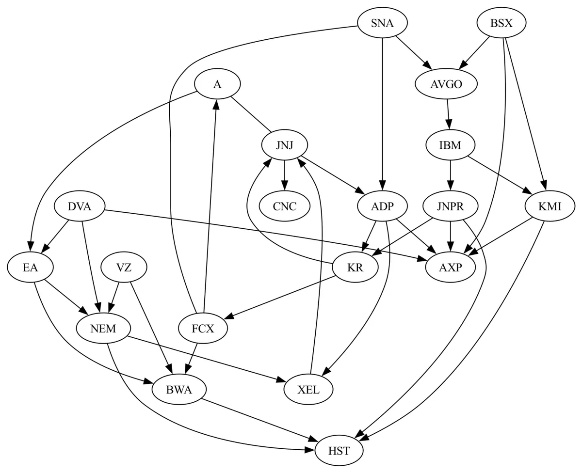
Look at that, what a beauty. The only company I know on this list is IBM. Interestingly, one of its dependencies Broadcom Inc produces semiconductors and infrastructure software products so that seems like a reasonable dependency. However, I set it up to use a random sample of 20 companies. When I ran it again, I get this.
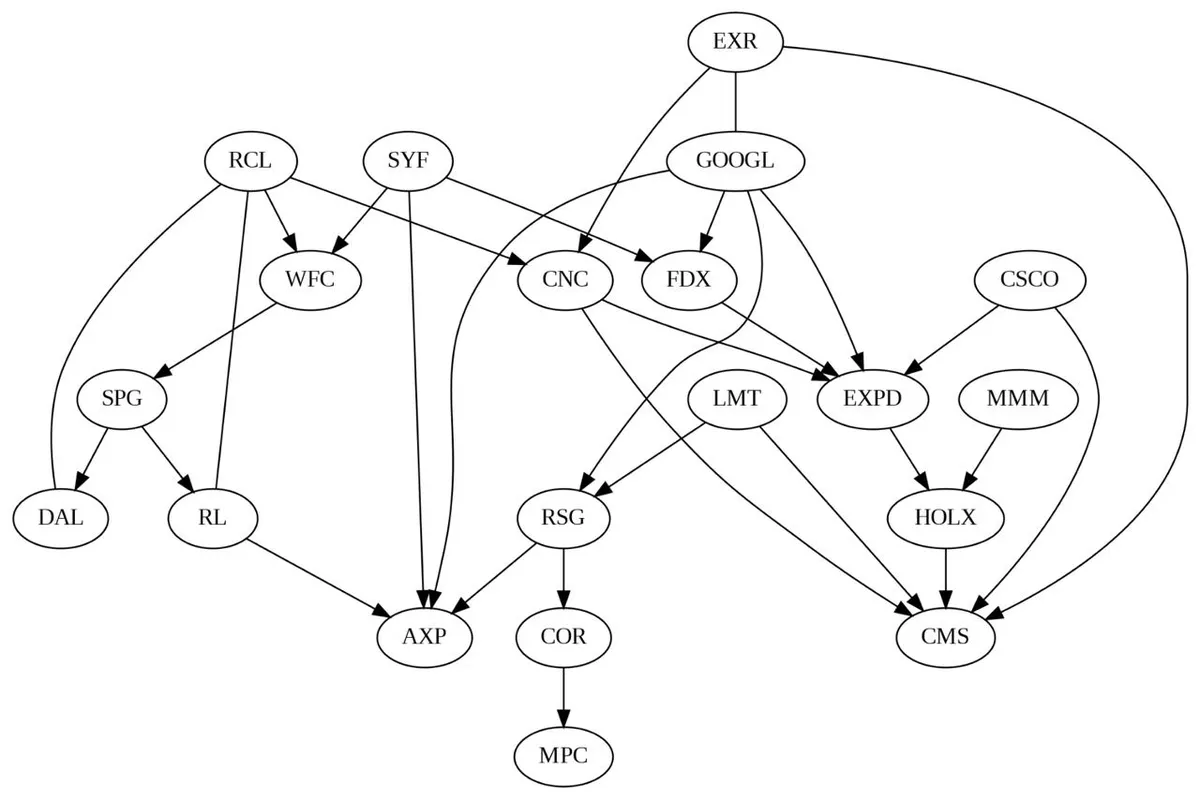
Which would indicate that a dependency for three companies, including Google, is Extra Space Inc. which is a real estate investment trust that invests in self storage facilities. Not sure if there's an obvious link there but in 2013, they did allocate a majority of their marketing budget to Google services Google 2013.
To conclude, what I want to do next is try and find a more computationally efficient form of the PC algorithm. The package we used had an implementation that in the worst case, has a runtime that is exponential to the number of nodes. When I tried to run this on all 366 companies, It gave me an estimated completion time of 26 hours. It also doesn't have support for GPU processing so a custom Google Colab environment didn't have much effect although I'm not much of a hardware guy so who knows.